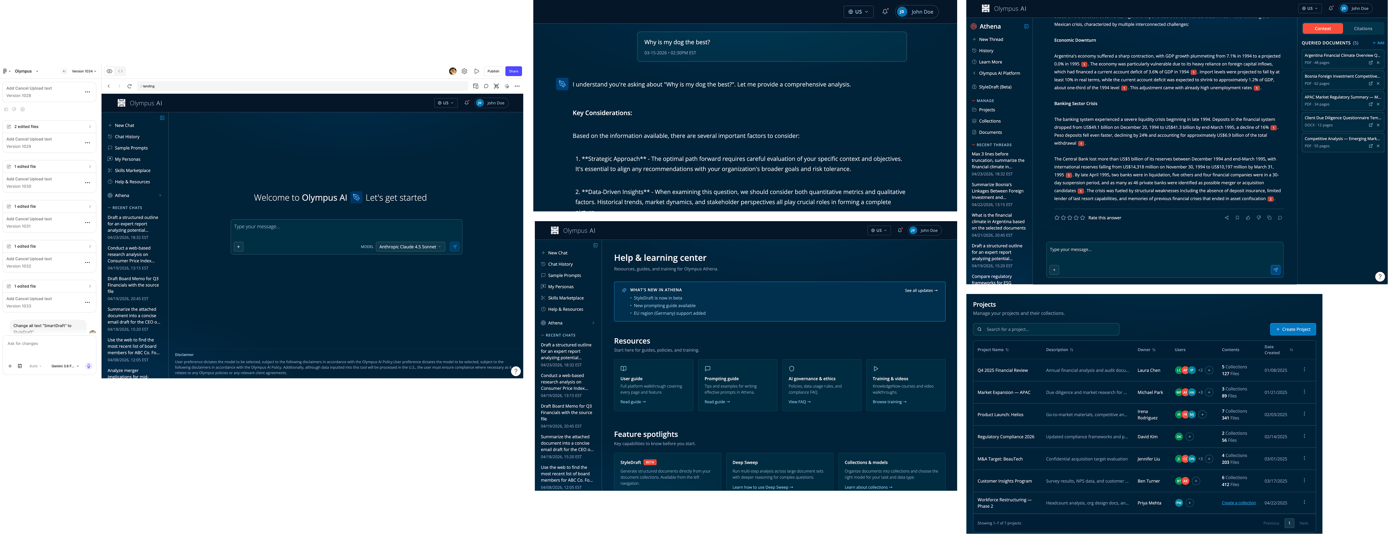
How do we make three disconnected AI tools feel like one coherent platform?
Olympus is the internal AI platform for a global consultancy of about 8,000 people, giving consultants secure, in-house access to AI-assisted research, drafting, and document analysis. It grew organically over a year or two: a general chatbot, a RAG-based research assistant called Athena capable of analyzing up to 10,000 documents at once, and a third specialist tool, added on as needs came up.
Adoption was uneven, and almost nobody could explain how to use several of the features. In an early kickoff, stakeholders lamented that the platform had become fragmented and needed to become a unified tool.
As the sole UX voice, I was pulled in to lead research, redesign, and prototyping, embedded with the data science group. My mandate: fix the friction and create a unified experience

A platform built for thousands, used meaningfully by a much smaller slice.
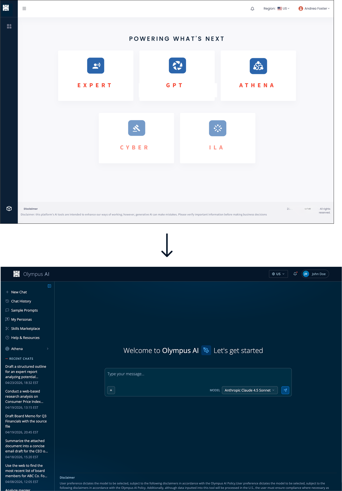
The chatbot tool had around 295 daily active users amongst the thousands who had access. Athena's usage was tracked by project rather than by person, since one person typically prompted for a whole team, but even so, only a fraction of eligible teams were active. The third specialist tool had a smaller user group, relying on it for one specific task. The landing page listed five tools with no descriptions or context, two of which had already been deactivated but never removed, creating a confusing entry point for new users.
The redesign needed to feel like one platform, not three tools stitched together.
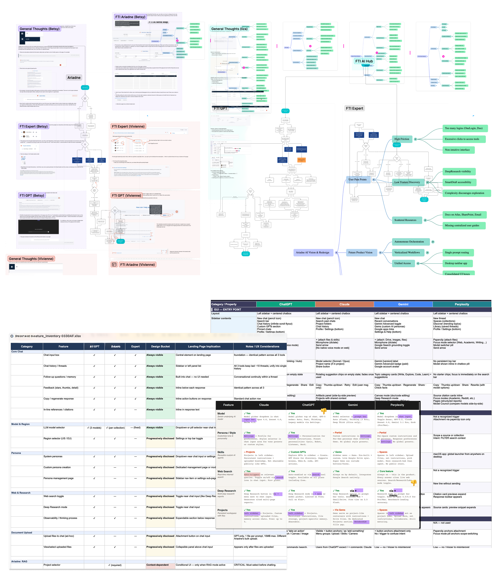
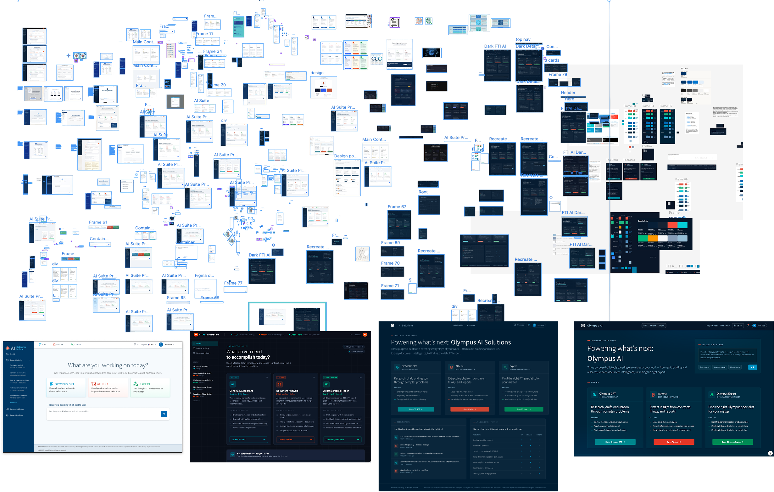
That single entry point took several rounds to get right. I explored numerous navigation patterns and layouts to fold the three tools into one, consulting development throughout to make sure each concept was actually buildable. Leadership initially asked for every feature of every tool to live inside a single GPT prompt box, but rough wireframes made the problem obvious fast: cramming everything into one interface just created a new, more cluttered version of the same confusion.
Every fix earned its place by weighing impact against
effort.Feedback from interviews, research into GPT and RAG-based tools, and user testing all fed into one prioritized list of fixes, ranked by impact against my own effort and development's. That list became my single source of truth, guiding design decisions, estimating time, and tracking scope as the work progressed.
Some fixes were quick wins. Others meant heavier lifting, including a full visual refresh for Olympus, complete with a long-requested dark mode. Through discovery, I settled on one guiding principle for that refresh: every screen should feel like part of the same product, not a patchwork of separate tools. That meant one visual language, one navigation pattern, and one entry point that routed people to the right tool without asking them to choose first.
I looked at how other products handled multiple complex tools under one roof and landed on a different structure: GPT became the general landing experience for Olympus, with Athena living in its own space, reachable from the main navigation but styled and structured in the same family and interaction patterns as its parent.
That split also made life easier for the Athena and GPT development teams, each could maintain their own code within a shared house instead of one tangled codebase. Expert, meanwhile, became a GPT add-on, with its own right rail surfacing relevant data pulled straight from the prompt.

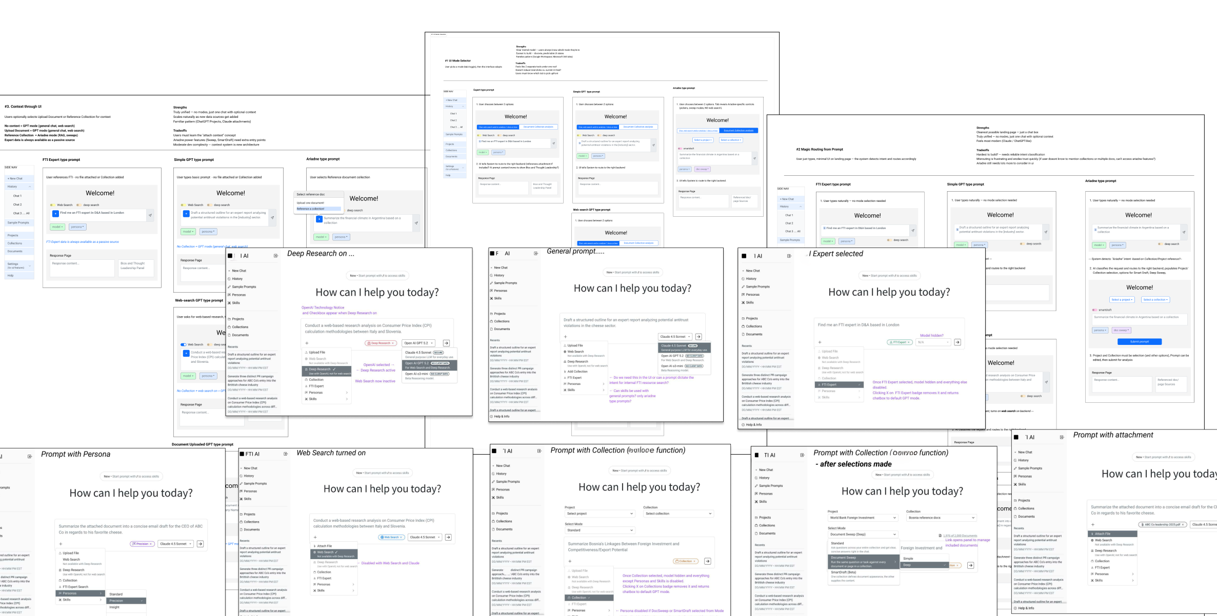
Uploads that looked stalled led to abandonment.
Athena's document pipeline was drawn, internally, as a simple three-step flow: upload, process, done. But interviews turned up something the diagram didn't show, a hidden approval step sitting between processing and completion, invisible to the user. From a user's seat, that meant uploads seemed to just stall.
People assumed the tool was broken and either re-uploaded or gave up. Support tickets piled up for a problem that wasn't actually a bug.
Even the upload modal itself had its own separate progress bar, a second status indicator for a process the user experiences as one continuous wait.
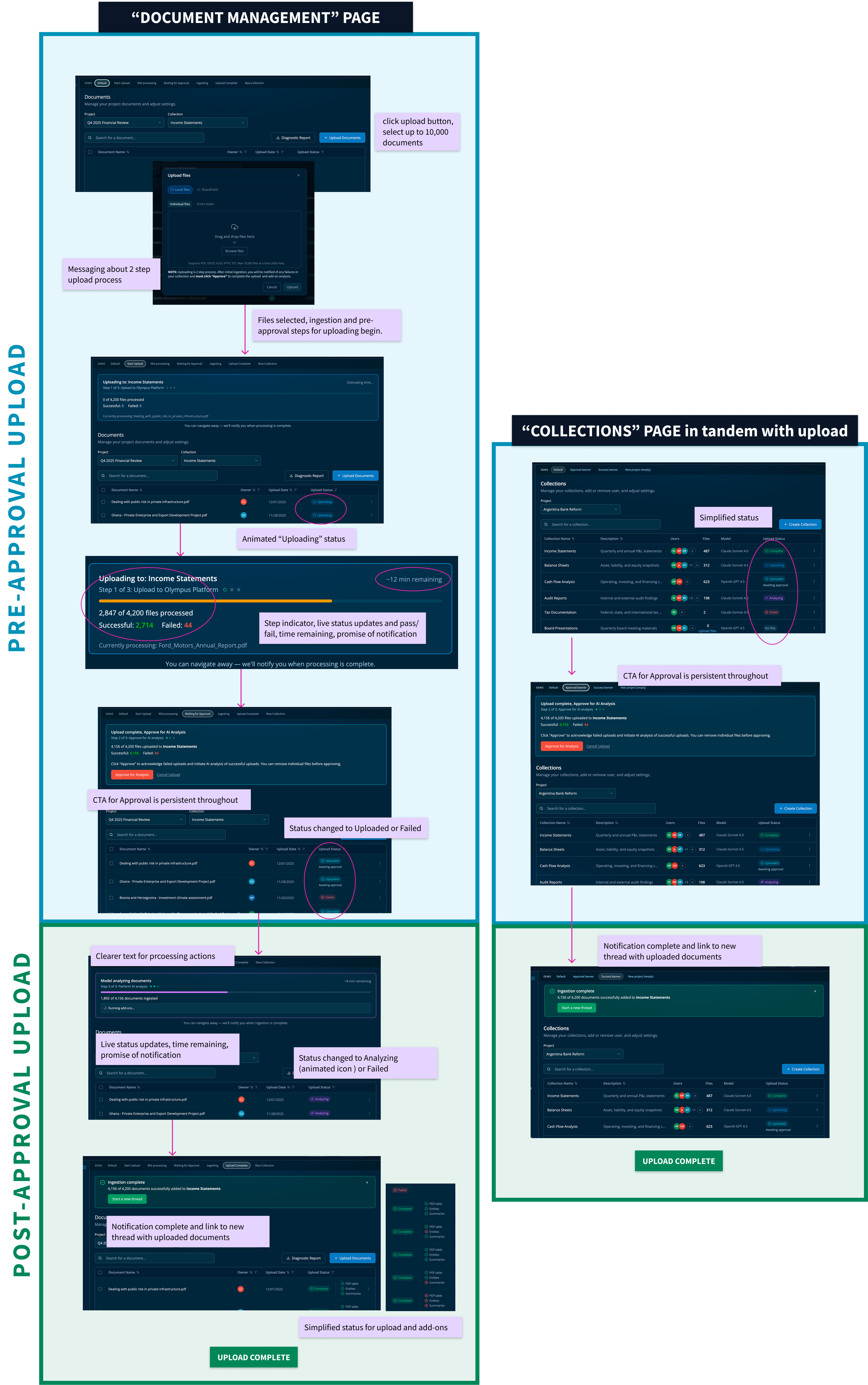
In the redesign, the deceptive first step no longer shows its own progress in the modal. It flows into the same unified status the user already sees, staging, uploading, review required, analyzing, ready, with failures still surfacing through the same tracker used for every other stage.
As an old design principle once said, status labels should tell users what they need to know or do, not describe what the system is doing internally.
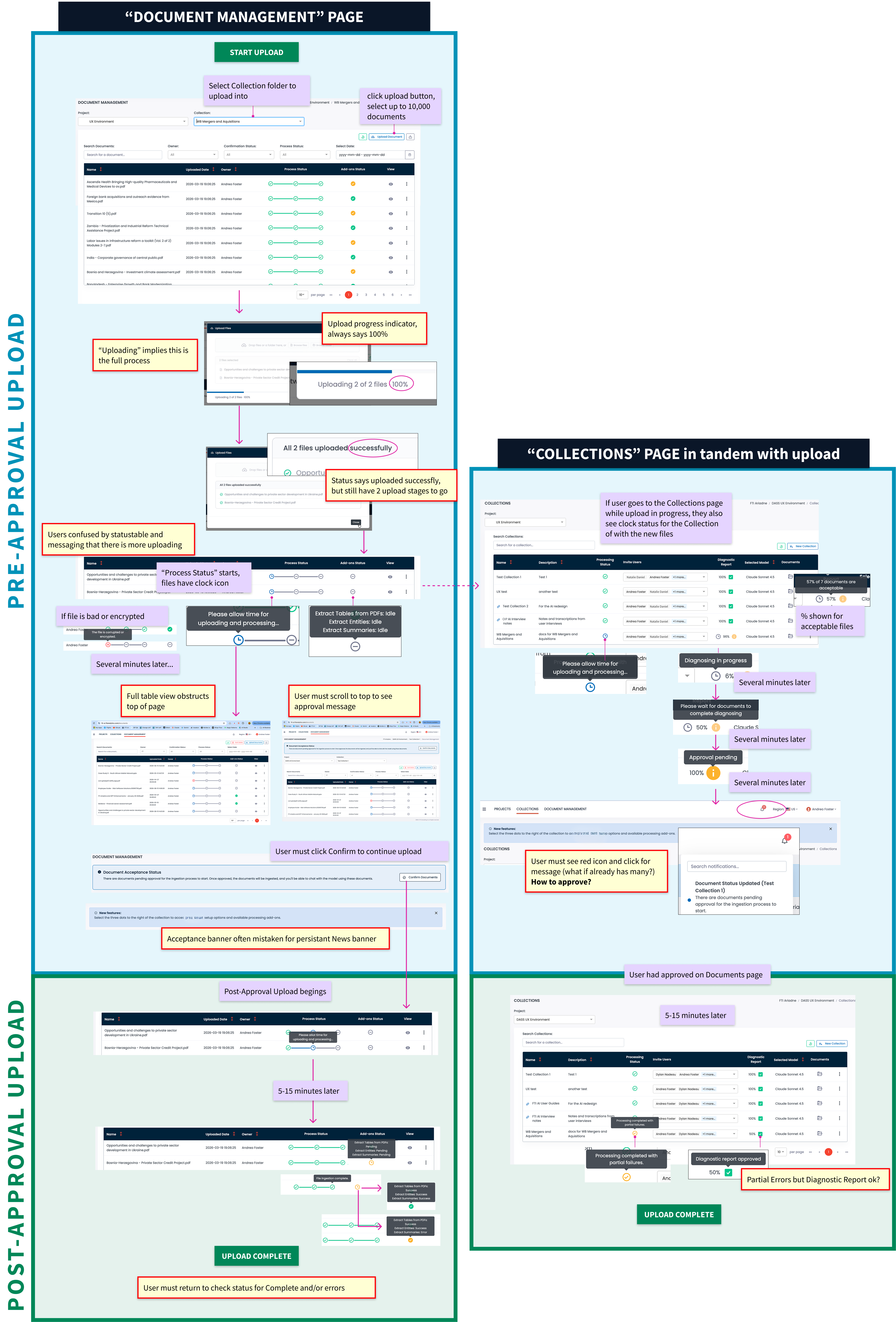
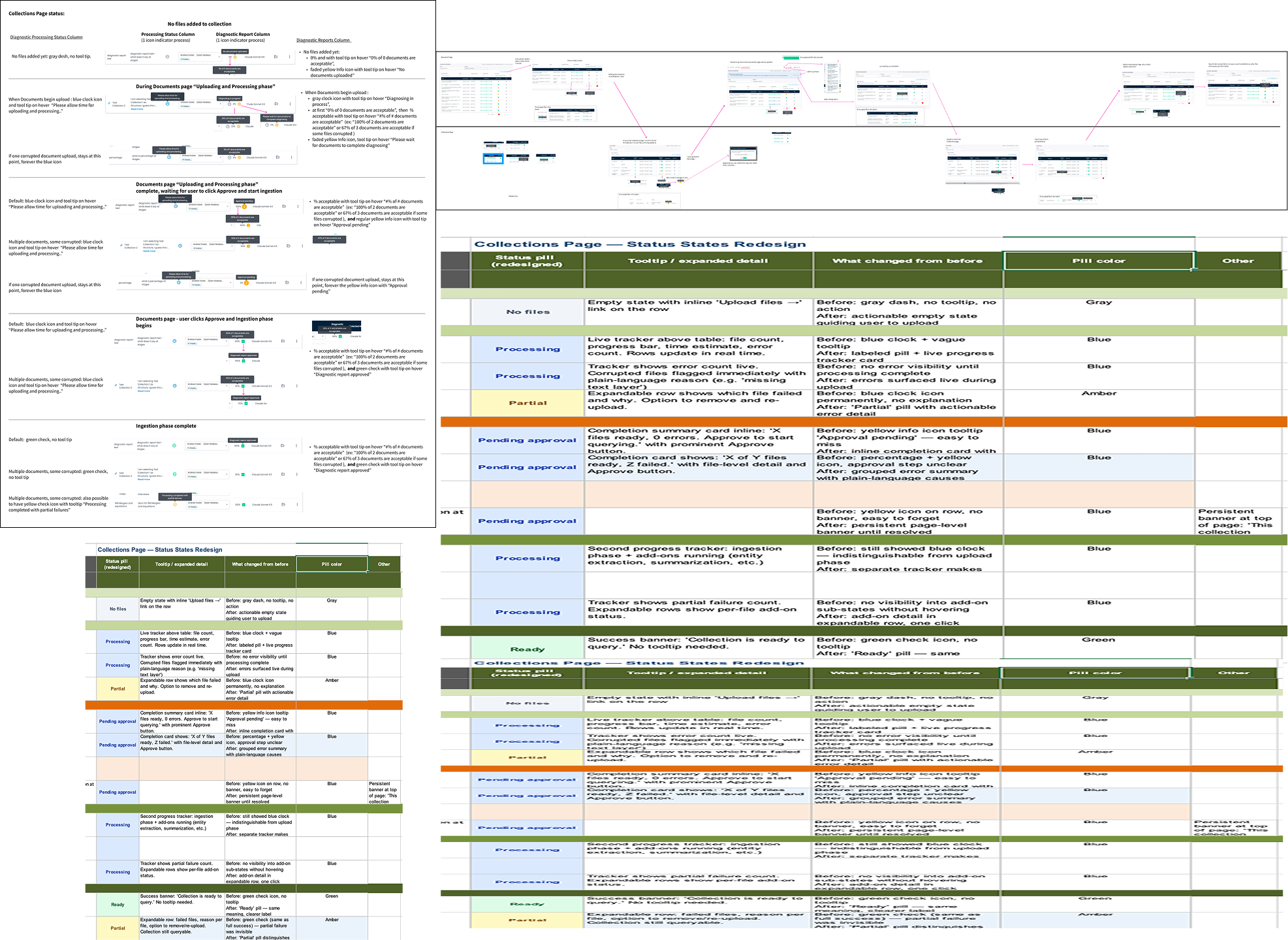
High value, low adoption, and a setup that punished new users.
Athena had a feature built for exactly the work power users needed most: pulling structure from one set of documents and content from another to generate a new draft in one pass, useful for proposals, reports, anything with a repeatable shape. Almost nobody used it.
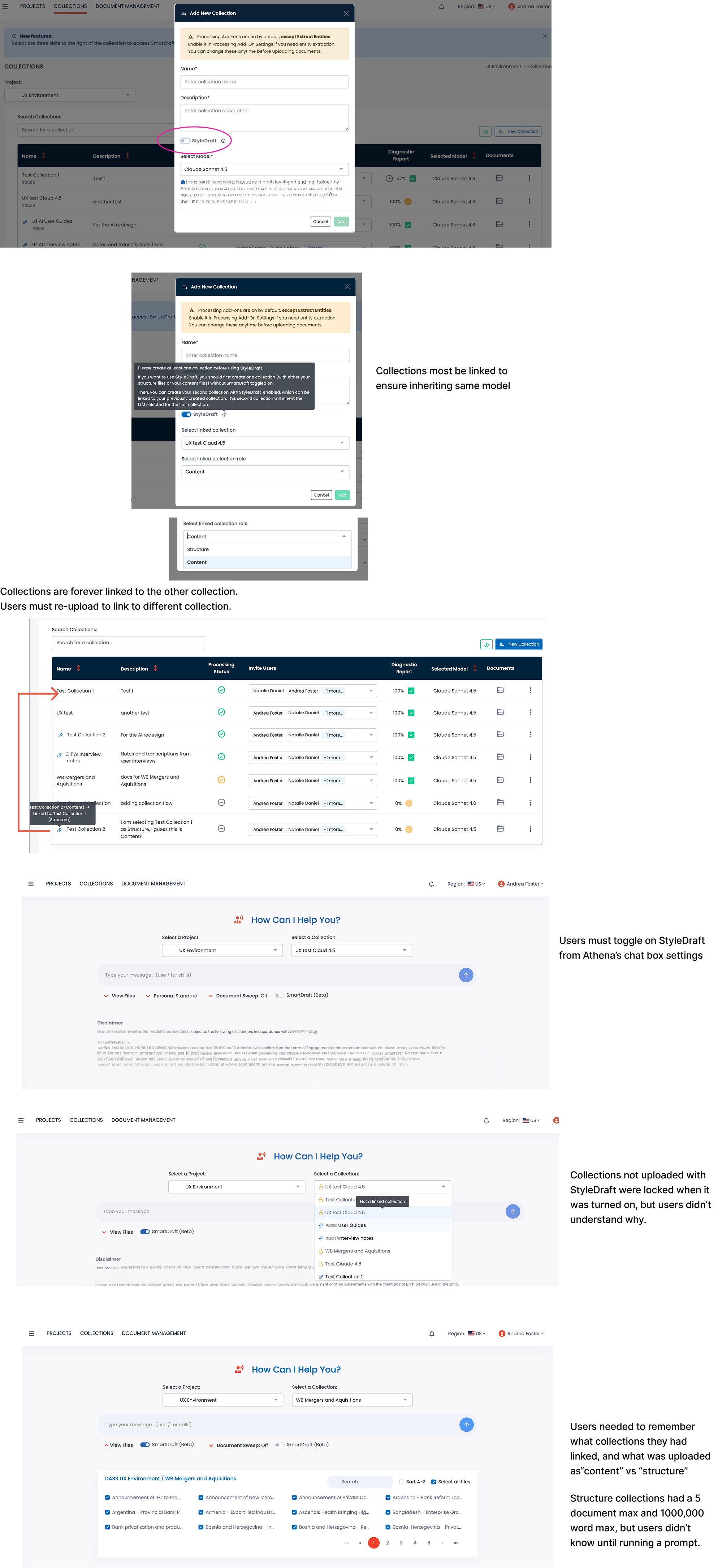
The reason for low adoption wasn't the feature, it was getting to it. Setup required two document collections, permanently linked the moment either was created, before the feature would run at all. Hidden constraints, a five-document cap, a 100,000-word limit, a same-model requirement, only surfaced after someone hit them. Talking with development, I learned the permanent linking wasn't even a real requirement, just an early workaround that had never been revisited.
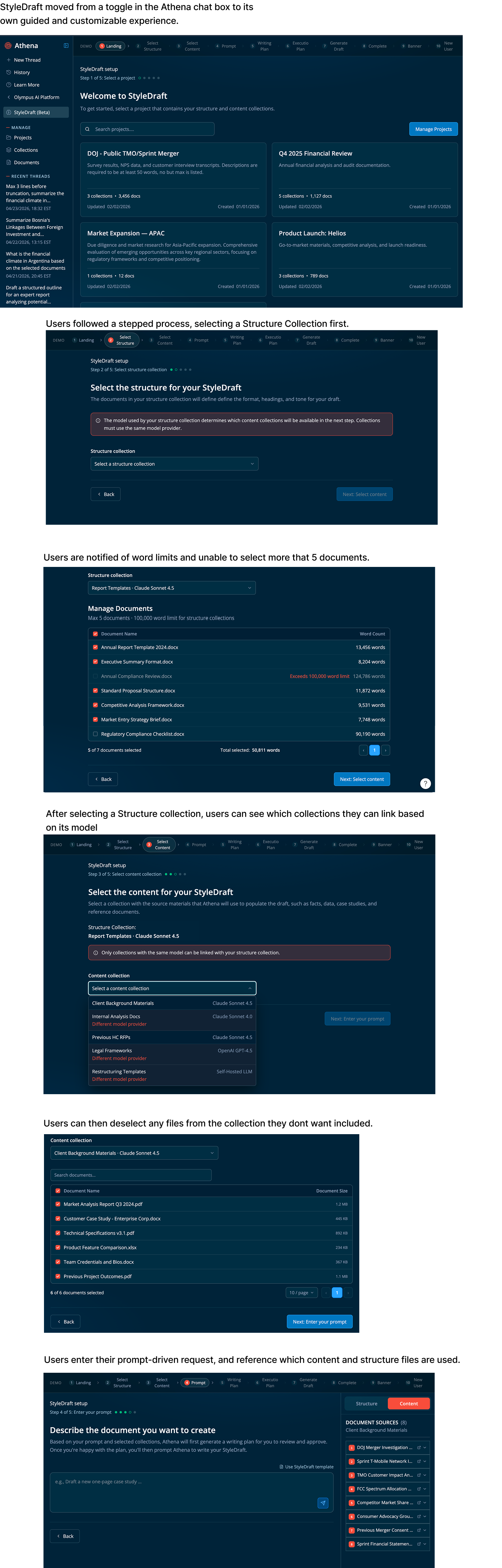
I rebuilt the entry point as a guided, step-by-step wizard in place of a setting users had to go hunting for inside Athena's prompt box: select a project, select structure, select content, describe the draft, review and generate. The constraints didn't disappear, but now the tool shows them up front instead of letting people discover them the hard way.
One prototype, fully interactive, built to be tried rather than explained.
Every piece of this work, including the unified entry point and visual refresh, the improved upload and status language, and the StyleDraft wizard, came together in a single interactive prototype built with AI-assisted prototyping tools rather than static mockups. Stakeholders and users could click through the real flows themselves.
The unification work reached full stakeholder sign-off; people who'd lived with the fragmented version for over a year saw it resolve problems they'd stopped expecting anyone to fix. I prepared it for developer handoff and was moved onto another project shortly after, as is the nature of consulting work where priorities shift fast.