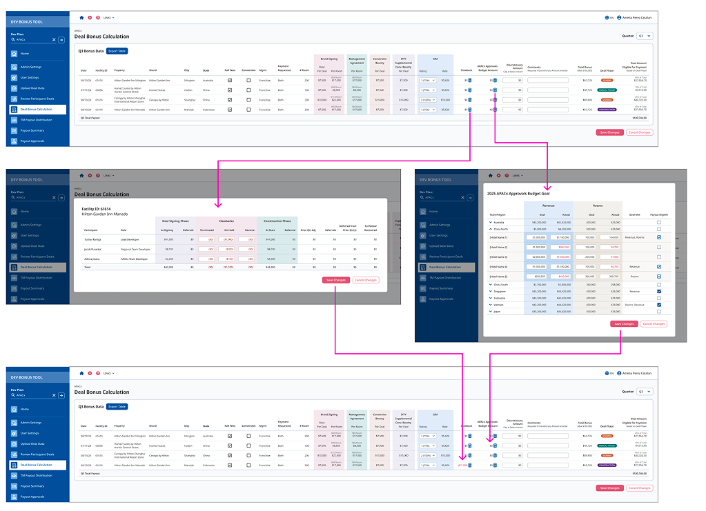
The Sales Incentive Plan (SIP) platform was built a decade ago for one of the world's largest hotel companies, and is used today by 4,000+ salespeople across 750+ hotels in 125+ countries. As part of a full platform modernization from Angular to React, I led a complete UX redesign.
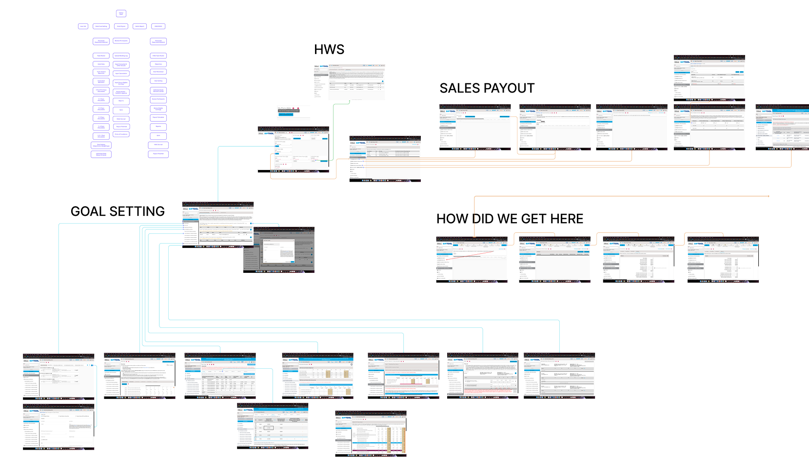
The SIP tool had a long history of evolving away from fragmented, manual processes, moving from spreadsheet-based tracking toward a centralized, secure, web-based system over several years. For this redesign, the priority had shifted to modernizing the tech stack and sharpening usability for a global, always-on sales force spanning dozens of time zones and regional variations in goals and job types.
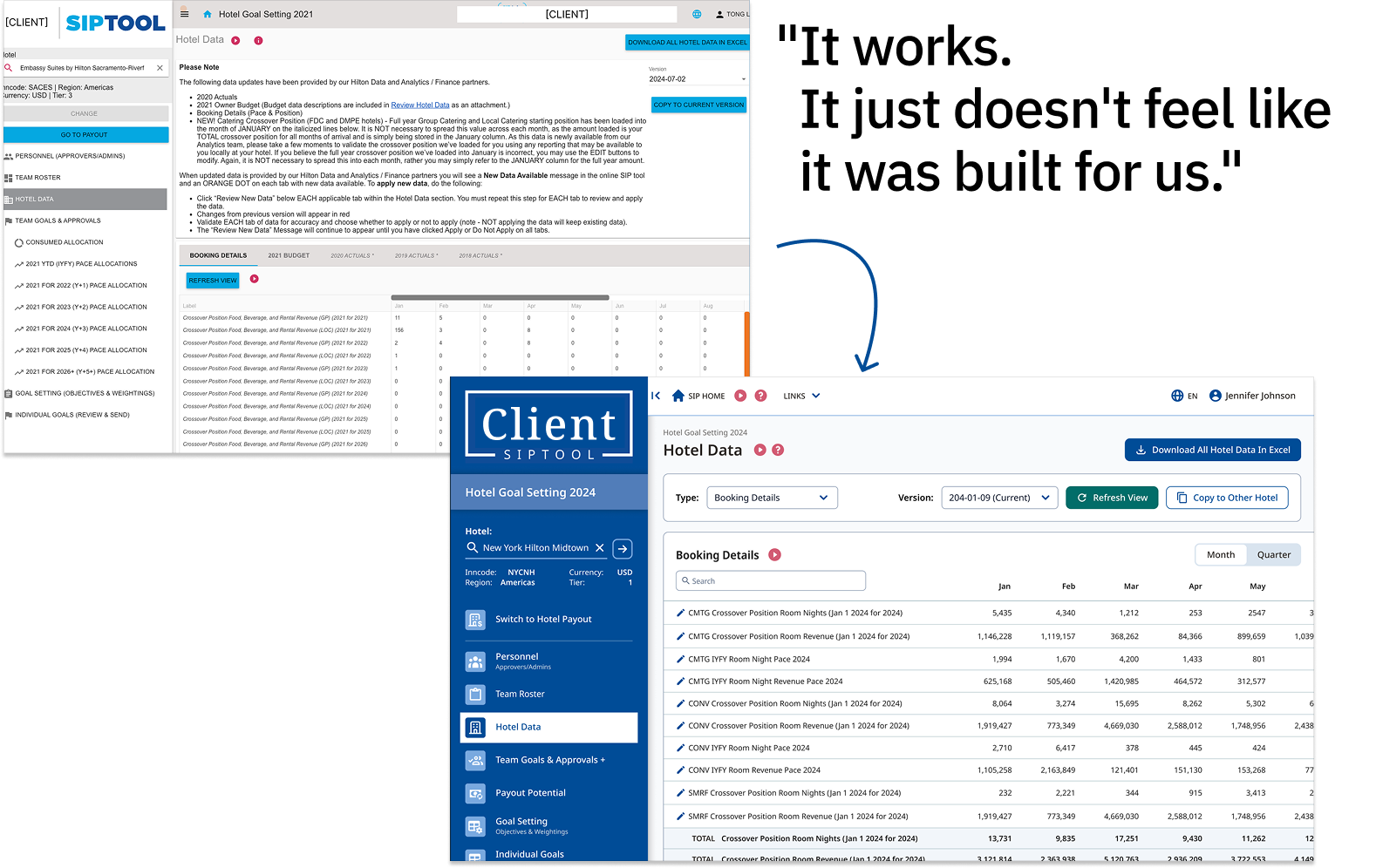
How do we make a global sales tool feel modern, trustworthy, and self-explanatory?
An outdated visual design made the tool feel generic rather than purpose-built, while unintuitive workflows forced users to rely on training and help docs to complete everyday tasks. The redesign needed to feel modern and custom-fit to earn trust, and be intuitive enough to use without hand-holding.
"If you have to relearn it every time, that's not a training problem."
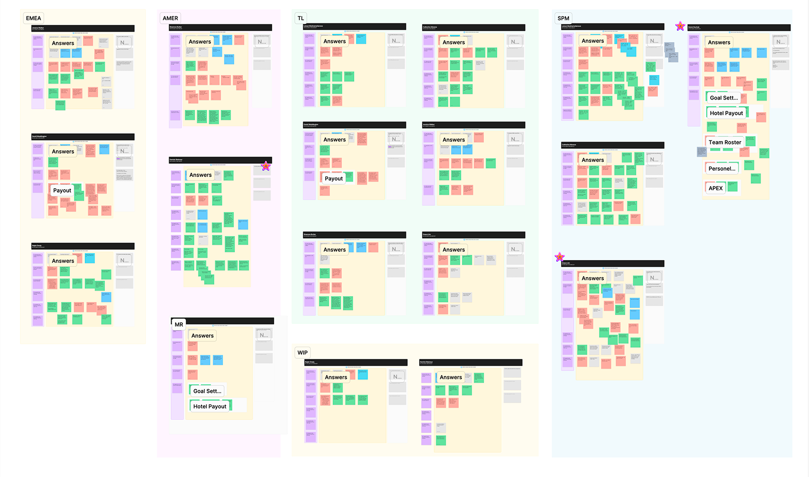
Research spanned two audiences: senior stakeholder sessions to surface pain points not visible from the outside, and a dozen primary user interviews across global markets to ground the redesign in real workflows rather than assumptions.
Together, they revealed that an outdated interface made the tool feel generic rather than purpose-built, while unintuitive workflows forced users to lean heavily on training and help documentation just to complete everyday tasks, made worse for the many users who only logged in weekly or monthly, and had to essentially relearn the tool each time.
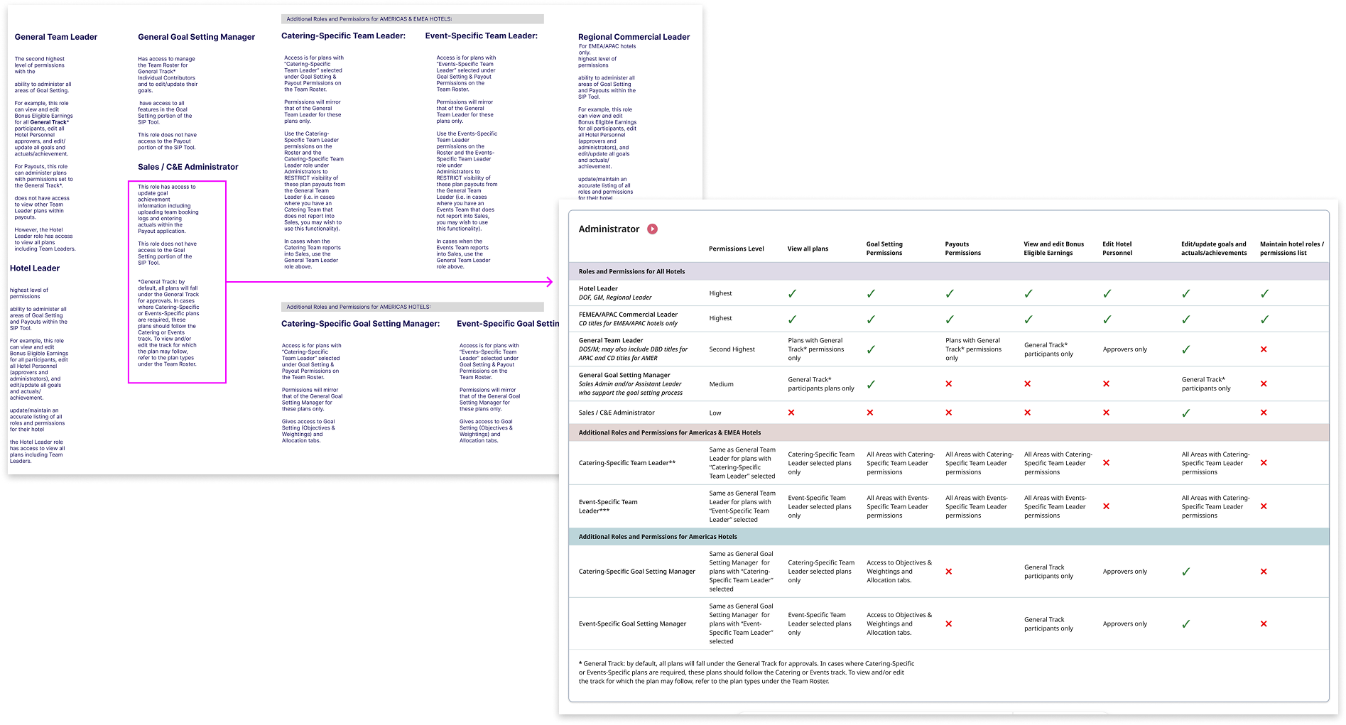
The interviews also surfaced just how differently the tool was used depending on who was using it. Some roles interacted with a handful of simple, repeatable tasks, while others managed complex, multi-layered responsibilities across teams, regions, and approval chains. Treating every user the same had been part of the problem.
With those distinctions clear, I designed tailored experiences for each role, simplifying where tasks were genuinely simple, and adding structure and clarity where the underlying complexity couldn't be avoided.
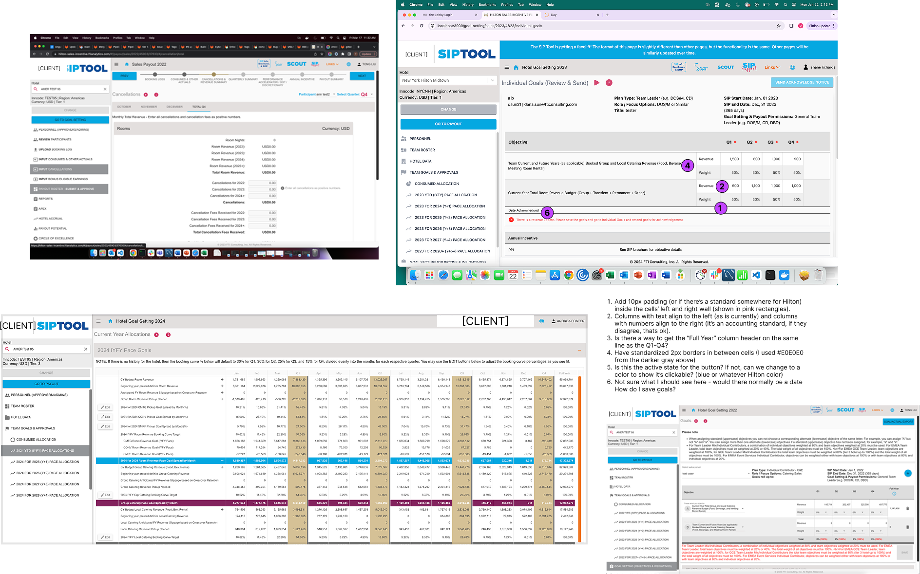
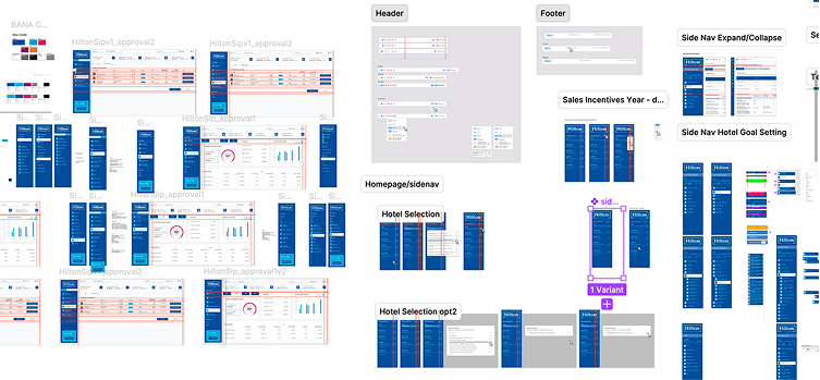
The UI modernization ran alongside a broader Angular-to-React platform migration, which meant protecting the reliability and security the tool had built its reputation on, while still meaningfully improving the day-to-day experience for a diverse international user base.To scale the work, I brought on and managed two additional team members with UX skills, involving them in interviews as well as production.
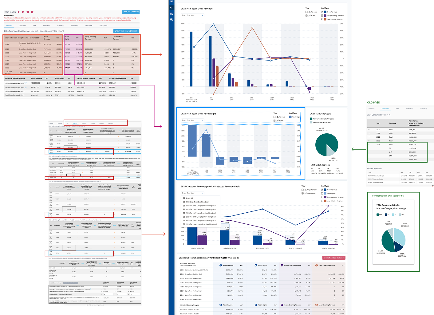
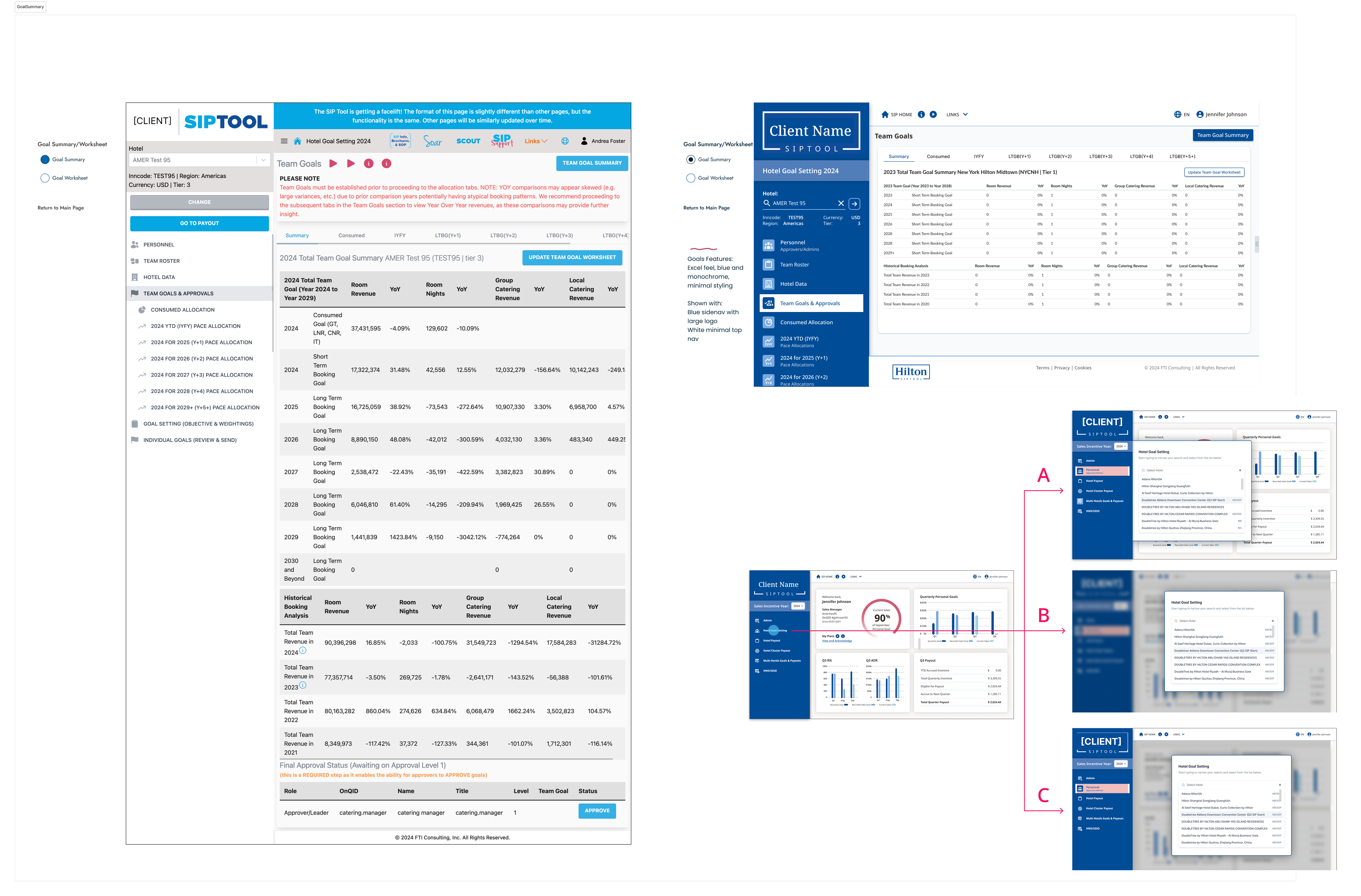
Within about two months, from mid-January to mid-March, I delivered the first batch of designs, covering the homepage, team roster, hotel data, and goal-setting pages, which moved directly into development following stakeholder review and approval.
From there, the redesign rolled out in phases: core homepage and goal-setting screens first, followed by hotel and team leader views, then final polish across admin, executive leadership, and payout screens.
Happy client, new product request
By June, the design system and style patterns were mature enough that the development team could take them forward independently across the rest of the platform. That success led the client to bring me back that October for a new tool: a companion incentive tool for their internal delivery teams.
Because of how successful the original redesign was, I was asked to lead design on this new tool as well.