Case Study:
Photo Damage Estimate Tool
UX Team Lead | StateFarm

Those sketches quickly evolved into illustrations for an enterprise tool which claim handlers used to assess vehicle and property while on the scene. The mobile app enabled them to access customer claim information and document damage via their device’s camera. While it sounded good on paper, the initial version needed to be more intuitive, and I was pulled in to provide visual guidance and illustrations.
User flows, app maps and style guides
As I continued to work on visual indicators for the app, I began untangling the user flow simplifying interactions, and mapping data with ancient backend systems. In addition to improving the architecture, a style guide was also established to ensure consistency throughout the app.

Usability testing and worksite observation
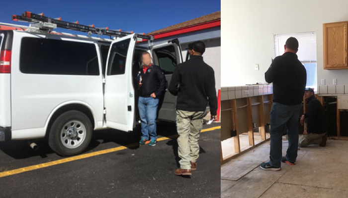
In-house usability testing and side-by-side trips with claims handlers helped us understand pain points and frustrations. Speaking directly with users shed light on their varying levels of technological competency and the difficulties of on-site work.


Early whiteboarding sessions and sketching
As the mobile app was improved, StateFarm had a new idea: use the existing framework to create a customer-facing tool for assessing vehicle damage. This new tool would enable claimants to receive estimates via their mobile device, save them a trip to the body shop for damage quote and instantly receive payment directly via EFT.
Ideas quickly filled whiteboards as a small UX group thought through ways a customer could take photos of their vehicle’s damage and use machine learning to provide a quick estimate of damage costs.


Storyboarding the journey from start to finish.
Ideas were plotted out in storyboards so that leadership could quickly and easily understand the solutions we proposed for the slow and cumbersome process of getting a vehicle damage estimate.

Early working prototypes
UX and engineering sought ways to leverage optical recognition technology to auto-capture vehicle damage, much like cashing a check with a mobile device’s camera. Challenges due to multidimensional surfaces and unconventional user interactions arose had to be resolved through each new prototype. Development worked tirelessly to make the technology work, and I pushed continuously for interface and structural improvements.

On-boarding and visual guides
On-boarding screens, visual guides, and requests for specific interactions were passed through multiple rounds of user testing and revisions were made based on user feedback.


Working prototype
Once development had working code for a test device, users were taken out in a variety of weather and light conditions in Atlanta and Illinois. Feedback regarding content, design and technical issues were vital for discovering defects and pain points.

Video animatic
Even after a working prototype was available, it was still difficult to communicate the interactions to leadership. To help with understanding, I pieced videos and UI elements together to create an animatic for stakeholders.

Product launch
Once the tool went live, we tracked analytics to find drop off points and other issues that would prevent completion numbers. As more user feedback and analytic data rolled in, post-MVP improvements have been prioritized to improve the tool's usability and customer satisfaction.


